Blocks Deprecated
Deprecated: use the web blocks for new pages This block belongs to state pages and UI components. Existing pages keep running, but new pages should use the web blocks. See Web Pages and the migration guide.
combo chart
This block is part of the Component UI group and was last modified in core v10.6.7.
combo chart v10.6.7 Combination line and bar chart
In pins 17
- Name
valuerequired - Data
array - X Axis
fielddefinitionsrequired - Y Axis line
fielddefinitionsrequired - Y Axis bar
fielddefinitionsrequired - Row Colors
array - Height
number - Data colors
array - Theme
value - Color palette
valueSets the color palette for the columns
- Bar Width
numberWidth of the bars
- Curve
value - Marker size
number - Show data labels
condition - Label Position
valuePosition of the Data Label, options: Top, Center, Bottom
- Label fontsize
value - Label Color
value
Out pins 1
- uicomponent
uicomponent
graph |
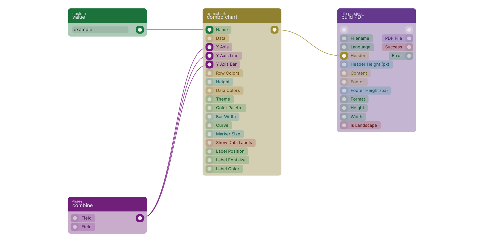
A typical wiring for combo chart: value feeds the co-name pin; combine feeds the co-xaxis pin; combine feeds the co-yaxis pin; combine feeds the co-yaxis-bar pin; the uicomponent out pin feeds build PDF.
Version history
Introduced in v10.6.7.
Back to
Component UI Return to the main group to view all sub-groups Back to apexcharts Return to the group to view all blocks within this group