Components
When leveraging RUAL for frontend development, you are likely to encounter complex logic. To simplify frontend development, we are making full React functionality available to our RUAL developers in any cluster, starting with version 13.0.6 and subsequent versions.
Existing Components
By default, we provide an extensive list of components within the blueprinting environment. These default blocks are React-based functional components, designed to equip the RUAL developer with a broad range of functionality integrated directly into blueprinting.
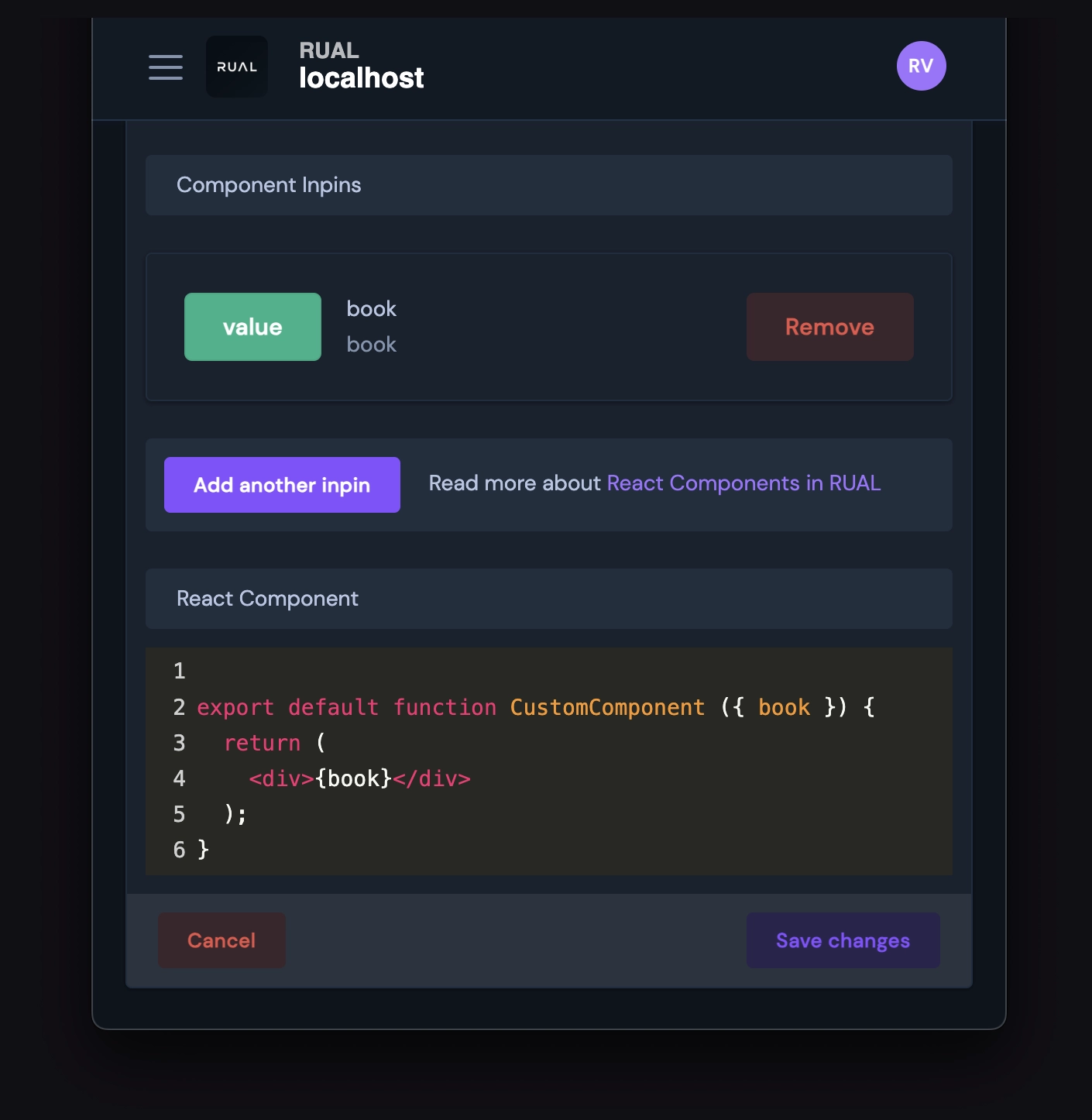
Although we aim to deliver most of the necessary functionality out of the box, we recognize that there may be unique needs that are not anticipated or covered by our default offerings. To accommodate the development of all types of frontend components, we offer full access to custom React functional component capabilities to RUAL developers through Custom Components in RUAL Studio.
Custom Components
In the most recent version of RUAL Core, v13.0.6 and subsequent versions, you will find an option titled "Manage Components" in the left-side menu. This section provides a comprehensive overview of the custom React components available across your entire cluster.
These React components should be constructed as React Functional Components and are capable of supporting all the functionalities expected of any React component. There are minor modifications required to facilitate integration with blueprinting, which will be discussed in further detail below.
Blueprint-Specific Parameters
For blocks that support storages or fields, accessing these through parameters is necessary. This approach promotes component reuse, although these parameters do not automatically appear in your code. Below is a list of parameters you can use, along with their respective usage descriptions.
| Parameter | Description |
|---|---|
bp_field |
A string that identifies the selected field name, which may be prefixed by the form identifier if a form_id inpin is present. |
bp_multiple_fields |
An array of objects, each containing a selected field. |
bp_hash |
A hash provided to FetchJS for retrieving fresh JavaScript when executing a script. |
bp_img_src |
A URL or data: URL for an asset generated by the backend. |
bp_submit_data |
An JWT-encoded object for submitting data to the backend. |
bp_hyperlink |
The URL of the selected State Page. |
bp_translate_key |
The translation key selected for the block. |
bp_action_guid |
An identifier used by some blocks to execute queries and interact with the backend storage. |
bp_iterate_component |
A path to the static custom component. Supply this to RUAL.fetchComponent, and it will return a valid cached React Component for your use. This is primarily utilized in iterative contexts, such as Advanced Datatables. |
Certain inpin IDs are not directly usable within a React Component. Below, we detail how these are remapped.
| Inpin ID | Parameter |
|---|---|
id |
rual_id |
Trigger a Blueprint Function
The example below illustrates how to trigger a blueprint function. Initially, you must define an inpin. In this case, we've used an inpin named onclick of the type Executable Function with the identifier onclick.
Using React Hooks
Here is an example of a custom component that leverages React State. You can import any standard React hook for use in such components.
Support for React Native className
If you're familiar with React Native, you might be aware that React Web does not accommodate object and array-based className properties. However, in RUAL, we provide support for these formats, enabling you to effortlessly combine and utilize multiple classes from inpins or other properties.