datetime local input
This block is part of the Component UI group and was last modified in core v11.3.0.
datetime local input v11.3.0 Basic HTML datetime local input element
In pins 7
- Field required
fielddefinitionsField to save the value in
- Validate
fieldvalidationApplies the given validation to the element, overwrites attributes given in the attributes popup
- Event
inputevent - min. date
dateThe minimum date that a user can start picking from (inclusive)
- max. date
dateThe maximum date that a user can pick to (inclusive).
- disabled dates
arrayA list of dates that can not be selected
- enabled dates
arrayA list of dates that can be selected
Out pins 1
- uicomponent
uicomponent
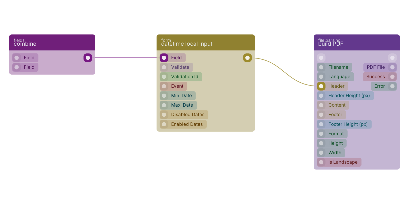
A typical wiring for datetime local input: combine feeds the co-fields pin; the uicomponent out pin feeds build PDF.
Version history
Introduced in v11.3.0.
Back to
Component UI Return to the main group to view all sub-groups Back to form Return to the group to view all blocks within this group