strong
This block is part of the state ui group and was last modified in core v13.0.6.
strong v13.0.1 Updated v13.0.6Indicates that its text has strong importance, seriousness, or urgency.
In pins 4
- Text required
valueThe text of the strong element.
- class
uiclassAssigns a CSS class to the element. • Hidden when unused
- style
uistyleApplies inline CSS style to the element • Hidden when unused
- attributes
uiattributesAdds custom attributes to the element. • Hidden when unused
Out pins 1
- state
stateReturns the element to the frontend state.
strong |
strong text |
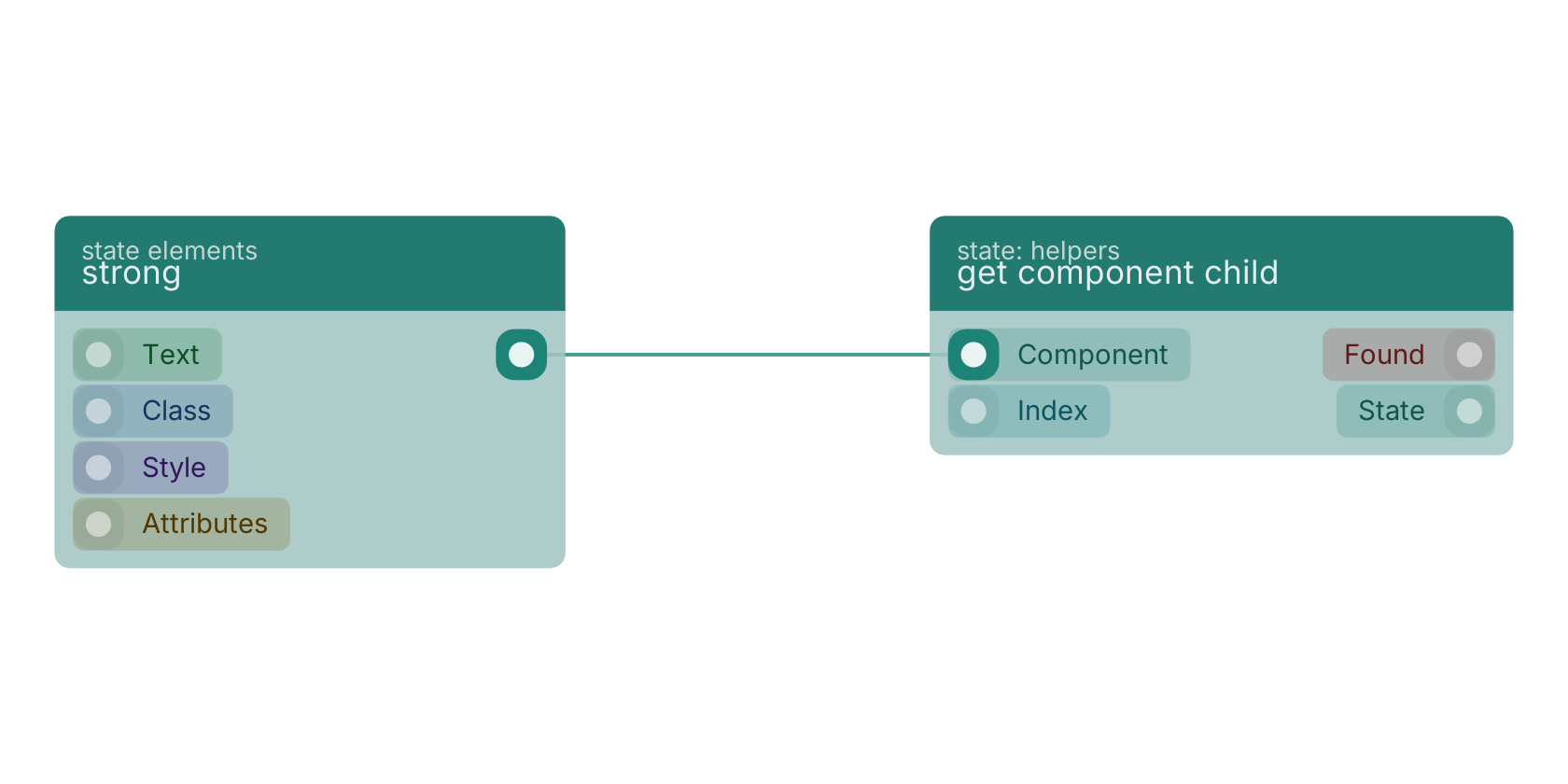
A typical wiring for strong: the state out pin feeds get component child.
Version history
Introduced in v13.0.1.
Last modified in v13.0.6.
Back to
state ui Return to the main group to view all sub-groups Back to state elements Return to the group to view all blocks within this group