h1
This block is part of the state ui group and was last modified in core v13.0.6.
h1 v13.0.1 Updated v13.0.6A H1 element.
- Content required
stateIntegrates content or data from other elements. • Hidden when other fields are filled
- Text required
valueThe text of the h1 element. • Hidden when other fields are filled
- class
uiclassAssigns a CSS class to the element. • Hidden when unused
- style
uistyleApplies inline CSS style to the element • Hidden when unused
- attributes
uiattributesAdds custom attributes to the element. • Hidden when unused
- state
stateReturns the element to the frontend state.
h1 |
header 1 |
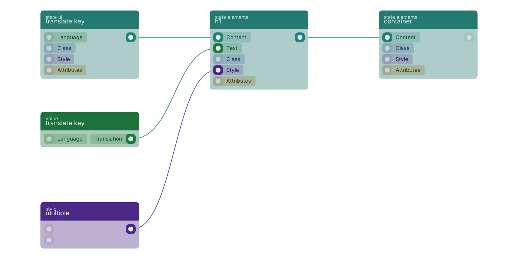
A typical wiring for h1: translate key feeds the content pin; multiple feeds the uistyle pin; translate key feeds the text pin; the state out pin feeds container.
Commonly used with
In production blueprints, this block is most often wired together with:
- container: this block feeds into it. A div with the class container on it by default.
- translate key: feeds into this block. Translates a given key and builds DOM nodes from the HTML within these keys.
- div: this block feeds into it. Creates a dynamic and customizable div element on your web page.
- custom text: feeds into this block.
- multiple: feeds into this block. Multiple styling.
- translate key: feeds into this block. Translates a given key.
Used in these guides
These documentation pages use or explain this block:
Version history
Introduced in v13.0.1.
Last modified in v13.0.6.
Back to
state ui Return to the main group to view all sub-groups Back to state elements Return to the group to view all blocks within this group