dropdown
This block is part of the state ui group and was last modified in core v13.0.5.
Field Selection Required
This block relies on a field that you select to perform its data actions. You must manually select the field you want to use in your flow using the field selector modal. To access the modal, click the white button on the block.
dropdown v13.0.1 Updated v13.0.5Generates a designed dropdown menu. The field will be used as state key.
- form id required
valueA unique ID for the form this field is used in.
- options required
arrayThe options to be shown in the dropdown. Can either be a list of values or
[{key, value}]. - class
uiclassAssigns a CSS class to the element. • Hidden when unused
- style
uistyleApplies inline CSS style to the element • Hidden when unused
- attributes
uiattributesAdds custom attributes to the element. • Hidden when unused
- state
stateReturns the element to the frontend state.
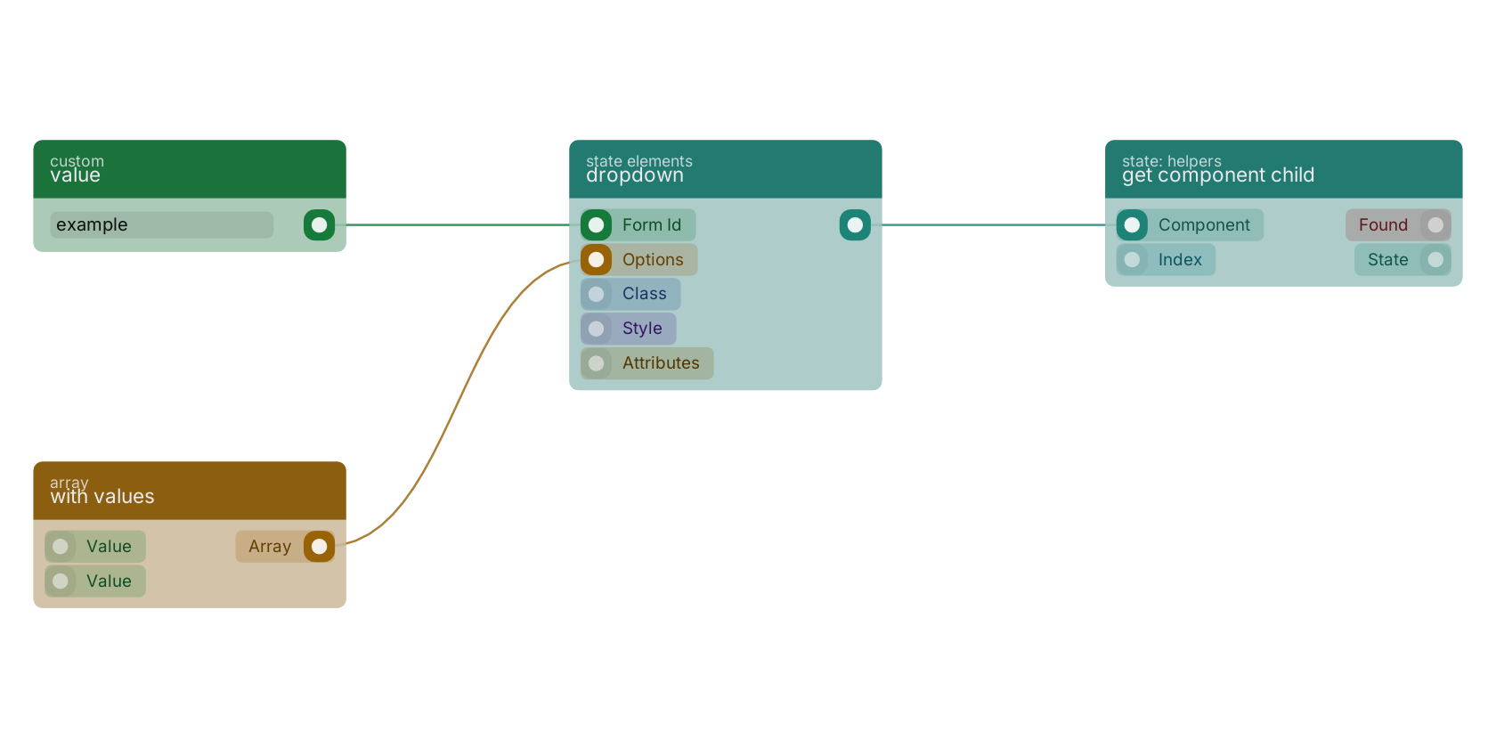
A typical wiring for dropdown: value feeds the form_id pin; with values feeds the options pin; the state out pin feeds get component child.
Version history
Introduced in v13.0.1.
Last modified in v13.0.5.
Back to
state ui Return to the main group to view all sub-groups Back to state elements Return to the group to view all blocks within this group