button
This block is part of the state ui group and was last modified in core v13.0.6.
button v13.0.1 Updated v13.0.6Generates a basic html button element with default styling.
- content required
stateContent to be shown within the button.
- Type
valueGives the option to overwrite the type.
- icon
valueIcon to be shown next to the button, be aware to include the icon font in your HTML/template. Icon can be updated using
state.icon - icon: style
uistyleStyle inline CSS style for the icon • Hidden when unused
- icon: class
uiclassAssigns a CSS class to the icon. • Hidden when unused
- class
uiclassAssigns a CSS class to the element. • Hidden when unused
- style
uistyleApplies inline CSS style to the element • Hidden when unused
- attributes
uiattributesAdds custom attributes to the element. • Hidden when unused
- events
v14.0.1stateeventsAdds event support to the element • Hidden when unused
- state
stateReturns the element to the frontend state.
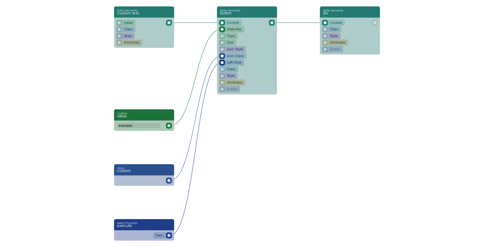
A typical wiring for button: execute feeds the inpinfunction pin; custom text feeds the content pin; custom feeds the iconclass pin; value feeds the state pin; the state out pin feeds div.
Commonly used with
In production blueprints, this block is most often wired together with:
- execute: feeds into this block. Enables you to choose a function that can be passed to other actions.
- div: this block feeds into it. Creates a dynamic and customizable div element on your web page.
- custom text: feeds into this block.
- custom: feeds into this block. Custom class input.
Version history
Introduced in v13.0.1.
Last modified in v13.0.6.
v14.0.2, click here to see the release notes. v14.0.1 This block or one of its pins was updated in v14.0.1, click here to see the release notes. Back to
state ui Return to the main group to view all sub-groups Back to state elements Return to the group to view all blocks within this group