button
This block is part of the state ui group and was last modified in core v13.0.6.
Function Selection Required
This block requires you to choose a custom function to execute when triggered. You must manually select the function you want to use using the function selector modal. To access the modal, click the white button on the block.
Connection Type
This block connects from a statedatatableconnection type block. Make sure to connect this block to the appropriate left-hand side connection.
button v13.0.1 Updated v13.0.6Adds a button that can be placed anywhere in the row.
- text required
valueTo be shown within the button, you can use data from the result like
{{ name }} - icon
valueTo be shown next to the next.
- class icon
v13.0.6uiclassHidden when unused
- style icon
v13.0.6uistyleHidden when unused
- attributes icon
v13.0.6uiattributesHidden when unused
- column title
v13.0.6valueColumn title to be shown for the column • Hidden when unused
- class
uiclassHidden when unused
- style
uistyleHidden when unused
- attributes
uiattributesHidden when unused
- add before
fielddefinitionsAdds the button before the given column. • Hidden when other fields are filled
- add after
fielddefinitionsAdds the button after the given column. • Hidden when other fields are filled
- statedatatableconnection
statedatatableconnection
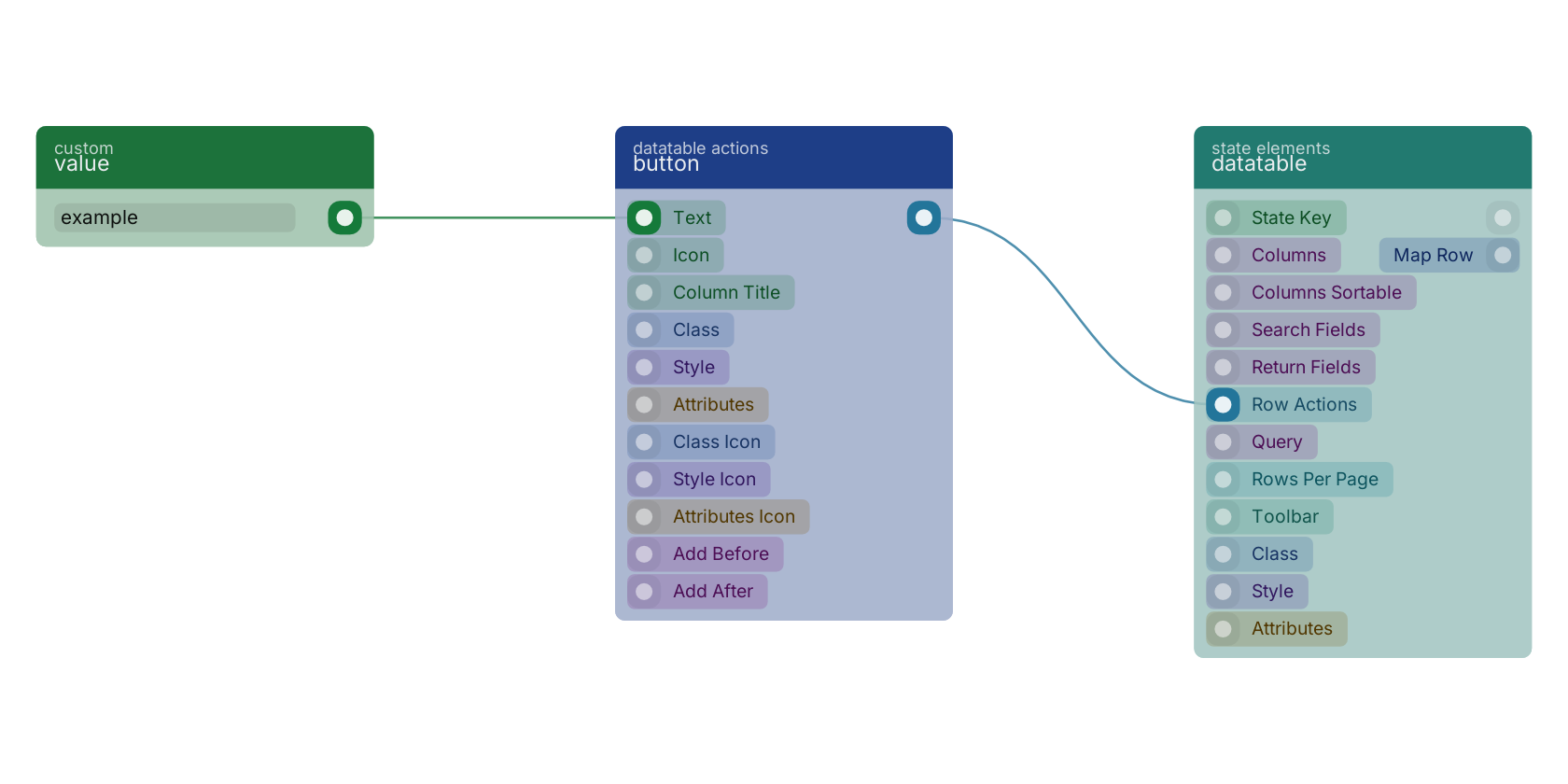
A typical wiring for button: value feeds the text pin; the statedatatableconnection out pin feeds datatable.
Version history
Introduced in v13.0.1.
Last modified in v13.0.6.
Back to
state ui Return to the main group to view all sub-groups Back to datatable actions Return to the group to view all blocks within this group